
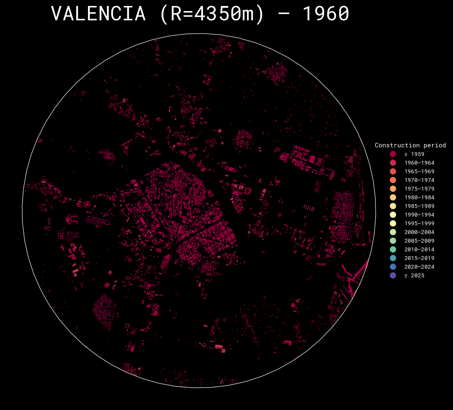
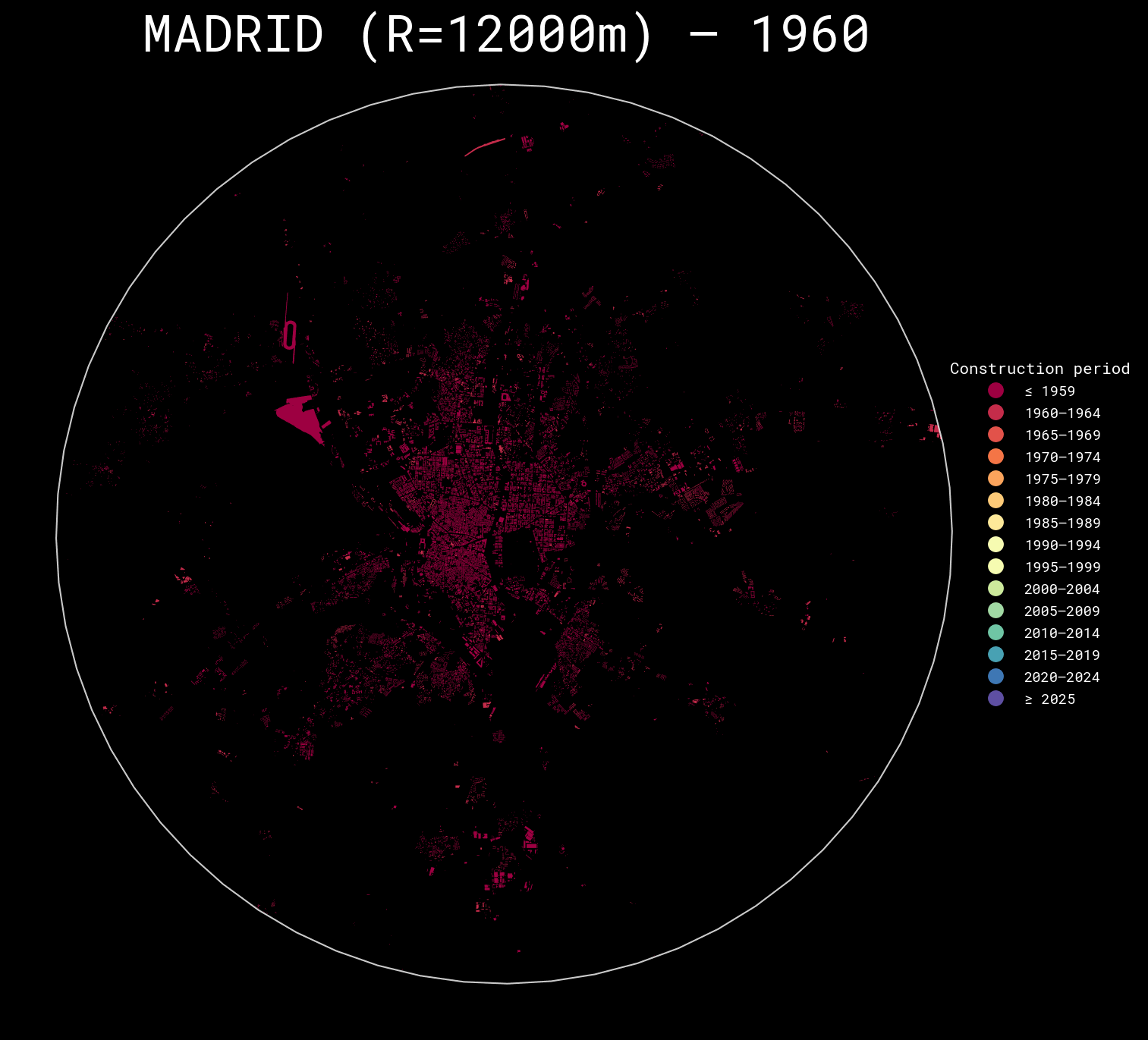
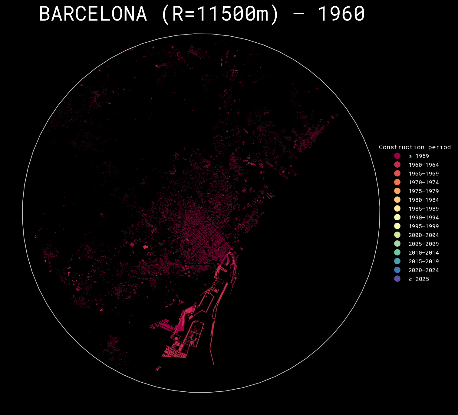
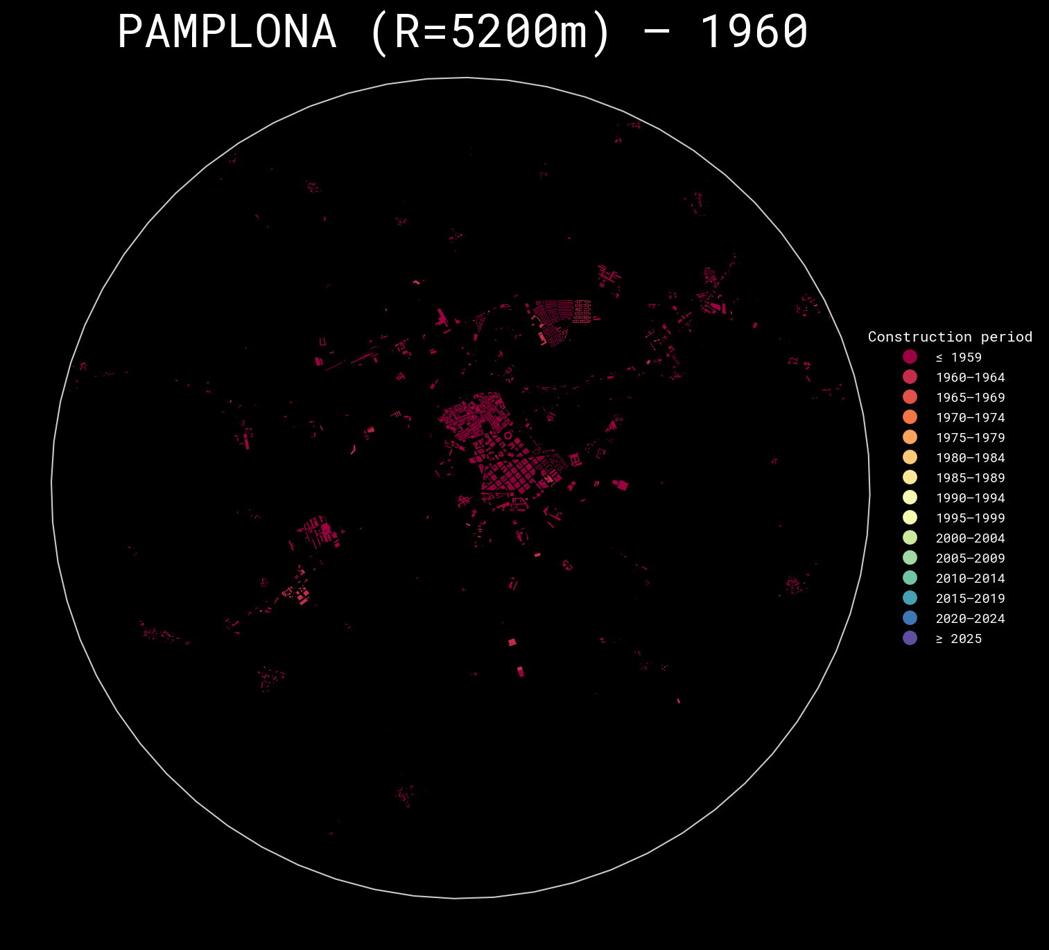
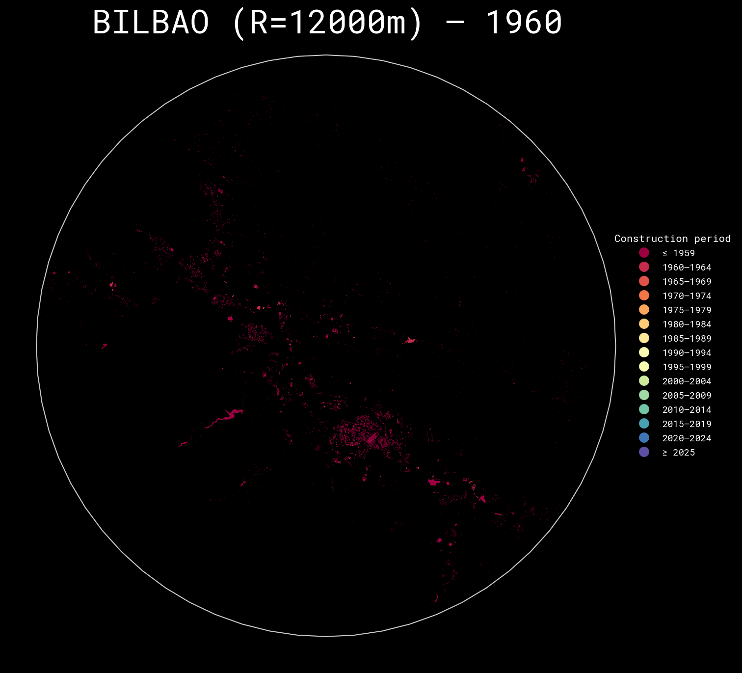
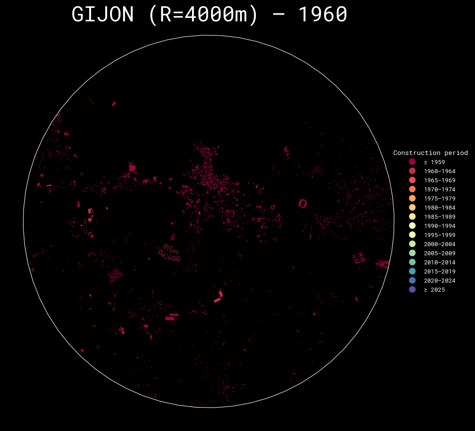
Vibecoding spanish cities construction year maps
Inspired by https://dominicroye.github.io/blog/visualize-urban-growth/, I decided to visualise and compare various spanish cities maps (and also check how good AI is at doing this job)..
Pipeline:
- check what data is required for an area to be visualized (for metropolitan areas we usually want to render multiple municipalities on a single map)
- Parse ATOM/XML feed to get GML data archives URLs
- Download/extract GML data (with caching).
- Merge multiple data sources together.
- Normalize geometry and CRS.
- Extract construction year (different logic for different data sources).
- Clip to desired ‘center’ coordinate + radius.
- Bin years for visualization.
- For each year in range - select buildings built by this year, plot and save output.
- Combine outputs into a gif.
AI involvement:
AI was able to:
- understand the entire required flow
- provide kinda-working-MVP script in Python (single data source into single picture)
- follow instructions to fix multiple encountered problems
- suggest how to write a similar script for the Basque Country / Navarra (they publish data in a different format), and gradually make it work.
- follow instructions to improve the scripts (e.g. combine multiple data sources, use caching etc.)
- follow instructions to combine pictures into gifs
Results:
So far, I am quite excited about AI’s capabilities!